The Heart Behind Our Logo
Our logo tells the story of who we are & how we work.


A UNIFIED COMMUNITY
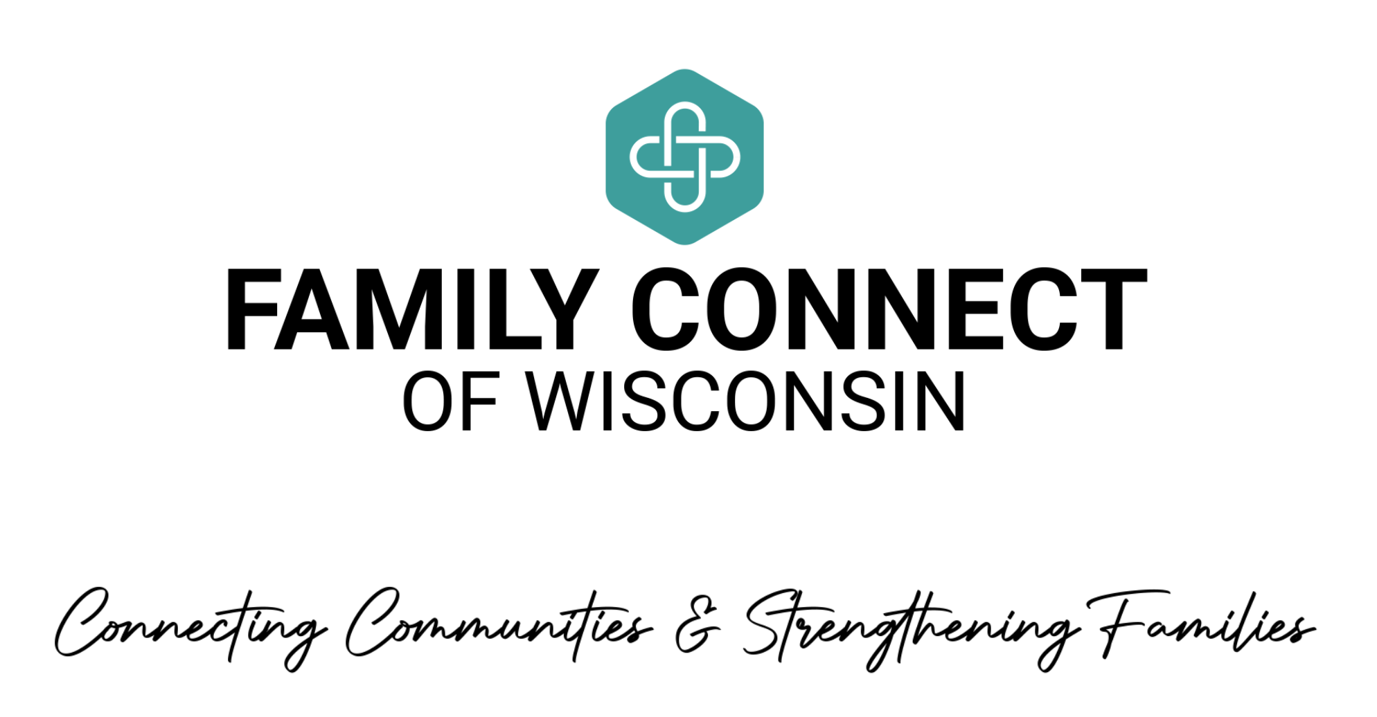
The hexagon represents a unified community, with each of its six points symbolizing the key partnerships that make our work possible:
Families at the center of our care
Churches who walk with families relationally and spiritually
Agency Partners on the frontlines to know the needs firsthand
Community Members who show up with compassion
Businesses who provide practical resources or services
Family Connect of Wisconsin activating and equipping the network
Each side of the hexagon plays a vital role in holding families up, reminding us that we're not meant to serve alone, but in partnership.


CONTINUOUS CONNECTION
At the center of the hexagon is an interwoven knot – an abstract symbol representing continuous connection, unity, and shared purpose.
This knot reflects how we're stronger together, with diverse roles interlinked and reinforcing one another. Its continuous loop represents our commitment to ongoing care– not just one-time help, but consistent support that builds trust and stability over time.
Together, these elements capture the kinds of communities we’re building across Wisconsin:
ones that show up, stay connected, and surround families with lasting strength.

